Small layout success...
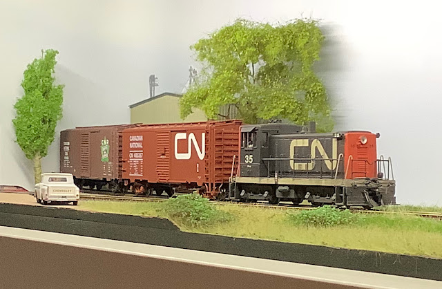
The potential spatial compromise enforced by building a small layout can often make it feel cramped, overcrowded and in fact emphasising its compact size. When I set out to build my own the aspiration has always been to instil both a sense of place and space…
Kinross is the latest chapter and follows a lineage stretching back to Creech Bottom, my first slice of Purbeck ball-clay narrow gauge, funnily enough in about the same space as Kinross takes up today. On the journey there have been successes and failures, learning from each in turn, what worked and as importantly what didn’t.
More recently Chris and I have been enjoying a collaborative and engaging sharing of ideas and inspiration and design. Whilst discussing layout building progress recently Chris remarked…
"It’s incredible how big Kinross feels. How effective even subtle variations in the shape of the land all contribute to a feeling of open space".
 |
| Kinross, Prince Edward Island in just 1000 millimetres... |
This stopped me in my tracks, and made me think. I replied…
"I’m trying to work out why this is the case...
I feel if between us we can distill the reason why a small layout can feel much larger, and explain it in an open, emotional yet descriptive manner we could help inspire and enthuse lots of armchair modellers".
The railroad is created to move a thing from over here to over there. If it was close enough, within arm's reach, we'd just shift it ourselves. As that distance increases we can't help but notice the effort we invest in that motion. Sentenced to a purgatory in the local park the retired steam engine is sentenced to an identity crisis by being robbed of its most defining characteristic: motion. Those sights and sounds we associate with the engine are all signatures of life and a satisfaction of purpose and work. That experience is not static; it is the record of motion. Our train must travel distance. It must go somewhere. That somewhere is often too far away, in real life, and not far enough in our model railway system where there's never that extra little bit we need.
I wondered how I'd open my contribution but then, over first coffees this morning I realised this was the perfect place to paraphrase Doctor Who: "A journey through time and space". If we think of the space of a layout as the walls of a box we can define the box by its dimensions and its contents; we could alter our relationship with the size of the box by concentrating on how we manipulate its contents to make it appear bigger on the inside. Scanning my library and looking for prototypes to base my model railways I'm met with so many good stories but all requiring more room than I have. Compressing them down into the space here has always been a feeling of coping with a minimum viable threshold for space. A dimension where, once you've compressed past it you've lost your connection to it. From the Central Western to Coy Paper, it's fun to contemplate this conversation and I'm looking forward to seeing how we explore it.
One evening over the weekend, tucked up with the dog on the sofa in front of the fire I pondered this with a beer. I wondered if it was a possible to distill the subject down to a few principles? Could it be that simple? I figured that it didn’t really matter, and if all the principles did was guide a conversation then they would have served their purpose. So to that end here they are, fuelled by a heady mix of sleeping dog, Innis and Gun and the warmth of that open fire:
Suggested principes of small layout success:
• Deliberate scene composition
• Consistent colour, both temperature and palette
• Theatrical style viewing window
We'll see if these 'themes' can help guide the conversation.
Composition I guess is essentially about balance... but before considering that, it's worth sharing the emotional driving force with Kinross - I wanted to create a feeling of open space that evoked memories exploring PEI with my Dad twenty years ago (long after the railway had been abandoned). This isn’t to say that emotion was more important than true prototype observation, rather the memories of an expansive landscape and wide open sky, the elements that set it aside in my memory from elsewhere in the Maritimes, should inform the layout more than prototypical scale dimension.
 |
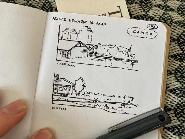
| Initial pen sketches in my notebook, thinking how the Cameo framed the view. |
Considering this I had two original thoughts for a PEI cameo, both inspired by photographs... the first, Cardigan by Bill Linley, the second a black and white photo by Steve Hunter of Kinross. I sketched out both ideas... trying to use elements of the scenes to give a sense of place but also that sense of space. It’s interesting that by the time I visited the railway was long gone, I’m using my passion for trains, one shared with my Dad, to tread this path and informing it through photos that capture something in their frozen moment that feels worth modelling.
The available space was small, just over 3 feet long, less than a foot deep… (or about 1m x 25cm footprint, 20cm tall). How was creating this sense of space possible in such a compact area? I think this is what I mean about composition… It’s a trick taught to me by my Dad that photographers often use, one of splitting the view into thirds. Let me explain… If the whole thing space was left open if wouldn’t feel open, it would feel small, however by providing visual interest and vertical height at each end with open in the middle, your eyes glancing over the whole layout interpret the whole as one without scaling the length of each part…
Creating space isn't about an empty layout, it's about carefully controlled contrast. The whole layout gives a feeling of space, not the open space itself...
The speeding ticket reports kilometers per hour. In the model railway we can use a similar relationship between distance and time such that if we can't alter one we can change the other. Instead of moving more quickly to cover more ground in less time, can we change how we consume time within a space that was previously considered too little? Often the answer to this question is met with a change in the complexity of a layout design and yields Timesaver switching puzzles based on a kind of checkers-like moderated complexity. If we just stretch a length of track across our four foot shelf our train reaches across this space pretty quickly. One length of track is too simple and the Timesaver too complex.
We all have our signature design elements - those things that no matter what model railway we are designing we include as our personal signatures. My 'long sidings' are probably my favourite signature element. On the Coy layout, my long siding serves the Coy's mill.
Comparing the long siding to the mainline there's a proportion where the mainline actually only reaches across maybe a third of the scene. An engine leading a train into the scene never quite makes it to centre stage. It does arrive far enough into the scene to declare its presence and provide us with time to appreciate its self. Arriving from off-stage we heard the build up of its movement, closer and closer, toward us and now it's here. Things like the middle of a place have an implied natural sense of purpose and balance and become like a destination. Not being there is not quite satisfying. That our engine creates such an opening act only to fall short of centre stage leaves an unease that we punctuate by transforming its first character of 'engine leading train over distance' to 'engine doing something interesting within here'. I remember a time when I was delivering a presentation and lost my place. Breaking the unease of that awkward moment I probably did a couple of small actions to disrupt the pause before resuming my pace. Our engine does the same in a series of minor acts like uncoupling from its train and the few steps required to clear the headshunt's turnout before reversing to off-stage and into the beginning of the main act.The use of staging behind a backdrop as a place where the train originates is so common today and it's a powerful asset. Often in design our trains move fluidly in and out of staging and staging extends the length of the mainline run - but in doing so I think it can also undermine the separation between the reality contained within the backdrop's envelope, our layout proper, and that hidden area, representing the away, a place we are trying to ignore if only to further the illusion that we occupy more than we have.
Listening to Chris, I notice we have brought different ways to approach this same question. I thought about scene composition 'on set', what I love is that Chris describes a wider consideration of composition of the scene with relation to staging, and how the two intrinsically combine...
Composition of the physical view in our scenic area is important, but as is it’s relationship to operation.
Considering both in an iterative nature will help the modeller instil that feeling of place, and space, in what is almost certainly a compressed impression of reality.
This is the first part of a trilogy, Chris and I are excited to share our ramblings with you all, but it just felt like too large a subject to squeeze into one post... we're not committing to a timetable, but there will be at least two more blogs on this subject, and we will tie the three together as they're written to help you navigate around the whole story.
(This post is mirrored on Chris’s blog too, Chris writes and charts his ideas and modelling regularly, a visit is always time well spent).


Comments
Post a Comment
Thank you for leaving a comment on my blog - I appreciate you taking the time to share your views. If you struggle to log in, please turn off the ‘block cross-site tracking’ setting in your browser.
James.