Hilton and Mears do the San Luis Central…
Chris and I have talked about light weight track over the past few months. Recently he suggested we both try designing a layout with this in mind, based on one of my favourites - the San Luis Central...
 |
| Photo 'GLC392' on Flickr (https://flic.kr/s/aHskJfhET3) |
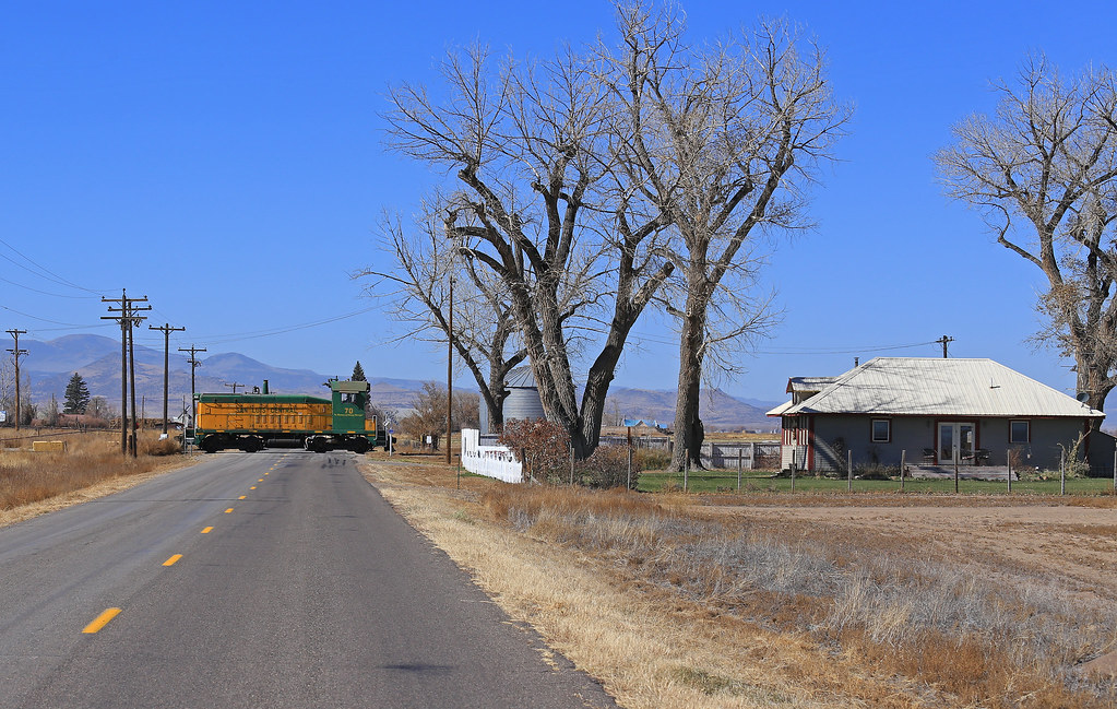
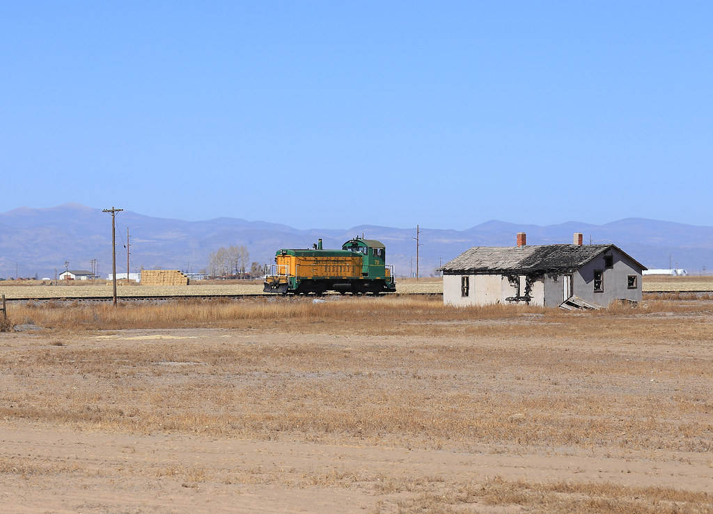
The San Luis Central Railroad is a shortline operating in the fertile central plains of Colorado. It links the aptly named 'Center' with 'Monte Vista', with a line that is arrow straight north / south, picking it's way between circular patterns of irrigation until it reaches the rambling 'Rio Grande' river on the outskirts of town, and it's connection with the rest of North America through a connection with the 'San Luis and Rio-Grande' (formerly a Rio Grande branchline).
 |
| Vastine, San Luis Central Railroad with SW8 running on the main. Note grain cars in the front spur. Photo 'GLC392' on Flickr (https://flic.kr/ps/2prkZq) |
 |
| Google Earth, annotated by James Hilton. |
As I discussed in my earlier overview of the short line, the line's bucolic character is crying out to be modelled but as with many British branchline prototypes the size required is substantial, even in N-scale. I suggested that perhaps the approach for many of us 'space starved' modellers is a cameo, a snap shot almost like some of the views in the wonderful video, a window on the line that accentuates it's long narrow character whilst not requiring a 20ft long straight wall to mount it along.
Details like 70 tonners and rural railroading seem to lead us into thinking of a railroad moving only a few cars in a small space but the SJC seems to move large volumes of cars using those same small engines. Accordingly its customers exist in large buildings set in wide open spaces. As we continue to step through a list of the SJC's characteristics we decorate our list of things with adjectives like "large" and "wide open" so to model this, we need a lot of space. Space that is invested in the space between places and acts as a white space to wrap around our scenes and bed them in and space that is the distance we travel through. Further, this railroad is one long straight of track. Distilling it into a small space with tight curves would only further remove us from the railroad's individuality. Instead of forcing something large into a box that is small, this seems like the perfect place for us to look at extracts from this railroad so we can model the big and large in a way that feels right.
As Chris says the challenge here for me is how to compress a long straight railroad into my favourite muse, a space little more than a metre long? Even trying to compress Center into 8 feet (a re-take on Beaverbrook) seemed impossibly cramped - a ladder of three turnouts takes up a surprising amount of room - but it was Chris's challenge, and the arrival of a second Bachmann GE 70t here in North Wales that fuelled the creative process... a look at the map, aerial photography and photographs online and I landed at Vastine...
Recalling the approach I considered when thinking about the Prince Edward Island was to utilise view blocks at the front AND the rear of the layout creating a 'corridor' (Cardigan, in the original sketches). From this framing, the trains appear from between buildings, it seems a less contrived way of creating a stage managed exit. This may take care of one side of the layout, but how to frame the other? The traditional 'wings' of a cameo layout will help, the train disappearing off stage without you seeing a 'hole in the sky'.
How then, to reference the long straight nature of the line in approximately 4x1'? I would usually advocate positioning the track on an angle across your layout, to break up the horizontal, but in this case I suggest we use that to accentuate the straightness. The road at right angles, detailed in the foreground and disappearing into the horizon would suggest we're talking about a near eye level viewing height with such a layout. Add a self contained lighting pelmet and optional 'operational' fiddle sticks (as with Kinross) and you have a compact snap shot that goes some way to capturing some of the nature of the line...
Inspired by your cameo, I’m suggesting a little further along the line at Monte Vista Potatoes...
 |
| Edited snap shot from Google Earth, by Chris Mears |
Monte Vista Potatoes (MVP) would be in low relief and serve as a background 'texture'. As we discussed before I’d render it in low detail and very muted colours. The idea here being to gain the presence of its structural form to offer texture to the backdrop.
 |
| Sketch by Chris Mears |
There’s a line of track in front of MVP. It connects to nothing. I would bury it into the ground. On it I’d have some random generic boxcars playing the scenic role of cars being loaded.
The front is really the operating part. Supported by off-scene staging a procession of short trains alternates cars onto and off those opposing sidings.
That road crossing bisects the scene. At the railroad crossing its detail is most saturated but as we move away from the track it too follows that ideal of reducing colour and texture to return to basic forms alone where the road touches the scene’s edge.
There’s certainly scope here to host some varied car types...
Indeed, traditionally the potato harvest was transferred in a variety of old reefers. More recently refrigerated box cars are utilised on the line, often decorated with some form of graffiti! Grain cars can be seen working on the line, there are elevators at Vastine and Center. In addition to car storage along the line there is also a Propane dealer in Center who, I believe, still receives rail deliveries.
 |
| Typical second hand reefer. Many are just patch painted for the SLC. In addition the shoreline rosters a motley fleet of cylindrical hoppers. |
That feeling I get everytime I watch 'A day in the life' is a peculiar blend of inspiration, motivation and peaceful calm. The railroad performs it's task without fuss or fanfare, moving deliberately with a safe and gentle pace that matches the needs of the lines customers with the age of the infrastructure. When you add in the sublime GE70t, blue skies and distant mountains... that is why I want to model something of it...
The challenge with many prototypes is we just don't have the space to do them justice, and in my own case, too many prototypes are vying for my creative attention. That said, the cameo layout and the purchase of a 'signature' loco can allow you to exercise that particular prototype in a relatively compact form, both in time and space. Indeed once the 'itch is scratched' there is less of an emotional connection to ripping it all out and building something else...
 |
| Photo 'GLC392' on Flickr (https://flic.kr/s/aHskJfhET3) |
This is not the first of the San Luis Central on the blog, and with the GE70t project it won't be the last - whether there is enough energy behind the project to generate a complete layout remains to be seen, but in those moments of madness, when I need to just scale things back, that video so kindly shared is still the mindful experience that fuelled this all in the first place. Until next time, more soon...


Hi James,
ReplyDeleteJust now joining the party. Love the blog. So much of your thinking about railways and modeling is inline with my own. I keep saying ‘oh he gets it’ on the various topics you cover and the way you model. I’m also learning a lot from your modeling which by the way is excellent. Watched the video on this little short line and loved it. I totally see why this would make an appealing model starting with the simple paint scheme of the locomotive and expanding to the beautiful countryside of the area.
Keep up the good work.
Thank you and I’m pleased you’ve found the blog, even better you’re enjoying it. If I can help I always will, keep involved by commenting. Best wishes!
Delete