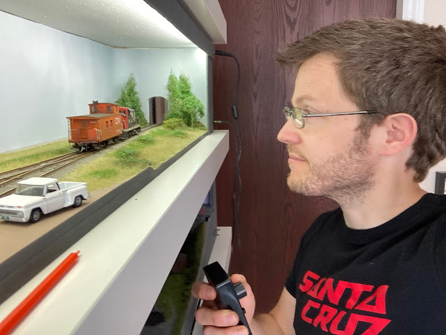
What is the optimum height to display a model railway? This is just one question that has come up through the discussion Chris and I are sharing with the N scale exploration and yet it feels like a separate but connected conversation...
 |
| Kinross is 60" off the deck, and I'm 5'6" |
There are many ways to consider this ranging from an operational view point to the constraints of your space. In search of a starting point I read some of the planning books in my library; the following from Iain Rice seems as good a place as any for kicking things off...
“Close up viewing has another benefit. The nearer the distance from which you view a scene, the narrower your field of vision, especially in the vertical sense…” Iain Rice, Shelf Layouts, Kalmbach 2009
Traditionally we’ve perhaps just thought about how H0 suits close up viewing at eye level… with Iain’s reflection coming to the fore… I’ve been exploring and exploiting this with all my cameo and shelf layouts in OO/ H0. But what about N? Although we strive for detail it is unlikely to stand up to the same close scrutiny as H0... as a result we’re viewing from further back hence our field of vision takes in more of the landscape, but what is the optimum height to view a layout in N? Does it depend on the landscape we’re modelling?
It’s a fascinating question. In the larger scales it’s always the trains we look at but in the smaller scales it’s difficult to focus on only the train—you invariably see its background in your peripheral—so the focal point is that space occupied by both the train and the scene. Moving back a little expands that.
Perhaps the Prairies would work well with a 60” height eye level view where we look along the scene and see a long horizon with towering elevators? We can’t get as much vertical height into our eye level ‘field of vision’ so the elevators seem massive, as they do on the prairies. However, that same viewing height wouldn’t work as well for the Rockies, where we need to maximise our appreciation of the vertical. In this we need our field of vision to take in more height, so perhaps looking down into the scene more, more like a 54” level scene gives the chance for some vertical scenery on the board, and then a backscene full of more of it…
I like your sketch and in it I’m the guy on the left. I walked over to Coy/Victoria/Manheim and it’s about 53” from the floor to the track and I’m 6’-1”. Because of N scale’s smaller size my sense of distance is changed in N and even though the length of the run doesn’t change my perception of it does. Not so much distance travelled but white space moved through. In the larger scales my focus is closer to the train and what it’s doing, in N it’s about that context of travel so moving back a little, up a little, away a little seems to effect that feeling.
So have we helped? It feels like our short conversation has drawn on others ideas, combined with a bit of science and we’ve come to some basic conclusion... that the viewing height depends on not just the scale, it’s not true to say all N scale layouts should be viewed from higher up, further back... rather it’s about the relationship between the viewing height and the prototype. What works best will depend on what you’re modelling and the relationship you have with that physical real world environment.
Perhaps more importantly, viewing height is a real world constraint just as the more obvious physical space available. You might have a room 12’ by 10’ but have bookcases 54” high... that’s going to push your layout in to the 56-60” height range., Just as I’ve discussed marrying a prototype to your available space is important, if viewing height is also a given this should be considered to find a prototype that not only fits the space but works well viewed at the proposed height. Until next time, more soon...


Hello! Long time caller first time listener here. Having read bits and pieces over the years, I suspect that we are leading ourselves astray by talking of viewing height when what we really mean is layout height. It is the vertical and horizontal distance between the eye and the model that counts, as both you and Chris acknowledge by noting your heights in relation to the heights of your current projects. This is important to distinguish, because doing so allows us to determine what needs to be controlled for a given effect. For instance, is it possible to get a better result if the layout is designed for sitting rather than standing? A height adjustable office chair is easy to come by, and designing the layout around such a thing such that a visitor can adjust it for their viewing pleasure might be viable (or perhaps a little on the low side so it is visible for wheelchair bound visitors). What about using a chairbound viewing for a main line at eye level and a standing birds eye view for operating the yard? And can that horizontal distance be controlled by positioning the line within the scene (or to get a different effect for different objects within a scene? What about visual cues outside the scene to influence how close the viewer places their eyes to the scene?
ReplyDeleteThis is why I write, to engage in a fantastic conversation like this…
DeleteOf course, you are right, it is viewing height we’re describing that is a relationship between layout and viewer. Why not consider different seating or standing options around a larger layout… great concept, it would need careful managing so not to become cumbersome, I often find myself getting up from a stationary chair when operating even smaller layouts so wheels would be a must and perhaps it would be worth doing some experiments before going headlong down that path.
In terms of viewing blocks that will be a future blog, as part of these conversations Chris and I have considered this as well, mainly in relation to a question about train lengths…
I really (really!) like that "What about visual clues outside the scene to influence how close the viewer places their eyes" comment. As the layout designers and builders we have this very strong connection to our work. We know absolutely where to stand and how to appreciate what we've created but when our friends come over to see what we've been working on how can we help them to experience the way we do? That might sound obsessive but if a reason to create a model railway is to have a place we can invite others into, to share something that brings us such great joy with people that bring us joy, than crafting that experience is a part of the offer.
DeleteChris
I was recently asked to submit a video of my layout for the N Gauge Forum Virtual Exhibition. Although I'd made the odd short clip of rolling stock in action, this invitation forced me to think about picture composition. Taking still photos from various positions and elevations was invaluable in planning the video.
ReplyDeleteI use a commercial OO back-scene on my N gauge layout, which helps a lot when framing low-angle shots.
I wonder whether integrating live video with real-world exhibitions (like rock concerts!) might be a way forward. Crowding at busy shows prevents anybody seeing the whole picture properly.
Mike
Mike, I find taking still photos as my layouts develop is a great way to check composition and adjust course as required. As an N gauge modeller I would be interested in your reflections on the wider topic discussed, but in this instance, viewing height?
DeleteI suppose it depends which 'head' I have on! If I'm looking to lose myself in the illusion of watching a real railway, then I need to be looking from track, platform, over-bridge or embankment height, as per most real-life views. If I'm looking as a modeller, then a 'helicopter' view is more useful to me. How did they do that? Where's the join? Do I recognise products, or has something novel been built? My own N Gauge layout sits at desktop level, but to enjoy it, or share images of it, I've been known to kneel alongside!
DeleteMike
I wonder if there's a need to start tailoring presentation styles to presentation mediums? When we design a stage for a concert we're designing to consume the presentation (as audience) from a predetermined ideal place.
DeleteWe might design a model railway to be operated so our design decisions are those that favour the operator physically interacting with the scene. Then we turn to take still photographs of the layout so the needs change. Maybe we could have one backdrop or lighting rig that favours the operator and a different setup for the photographer to use? Then, as you suggest, maybe even just a "green screen" to replace the painted backdrop where we could dub in real moving sky or a similar live backdrop? Maybe real life audio too?
Chris
Whilst I agree with all the above I also think we need to keep in mind that at exhibitions we have viewers of all sizes - we have children whom we want to encourage into the hobby, and we have disabled friends in wheelchairs who should not be disadvantaged by layouts so high they cannot possibly see them. Therefore eye level layouts are out for me, at least for exhibitable layouts.
ReplyDeleteI think this is always worth remembering yes Colin, however this discussion is primarily aimed at those looking at building home layouts.
DeleteDelete